Pantone unveils colour of the year – Very Peri
Whilst COVID-19 continues to dominate the headlines, global colour authority Pantone has been busy looking ahead to decide on a shade that will best encapsulate 2022.
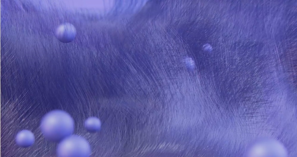
It recently unveiled Very Peri, a dynamic periwinkle blue hue with a vivifying violet-red undertone as the Pantone Color of the Year selection for 2022. The company says the Periwrinkle hue combines the steady tranquillity of blue with an energetic infusion of red.
It’s the first time the company has manufactured a colour instead of using a pre-existing archive and says this was a decision that was inspired by recent events: “The Pantone Color of the Year reflects what is taking place in our global culture, expressing what people are looking for that colour can hope to answer,” commented Laurie Pressman, Vice President of the Pantone Color Institute.
“Creating a new colour for the first time in the history of our Pantone Color of the Year educational colour program reflects the global innovation and transformation taking place.
“As society continues to recognize colour as a critical form of communication and as a way to express and affect ideas and emotions and engage and connect, the complexity of this new red-violet-infused blue hue highlights the expansive possibilities that lie before us.”
For Home Decor & Interior Design, PANTONE 17-3938 Very Peri injects a sense of playful freshness into home interiors, enlivening a space through unusual colour combinations. A versatile shade that animates our creative spirit, PANTONE 17-3938 Very Peri is suited to an array of different materials, textures and finishes, providing a pop of colour, whether introduced through a painted wall, accent furniture or home décor, or acting as an intriguing and eye-catching accent in a pattern.
About the Pantone Color of the Year
The Color of the Year selection process requires thoughtful consideration and trend analysis. To arrive at the selection each year, Pantone’s colour experts at the Pantone Color Institute comb the world looking for new colour influences. This can include the entertainment industry and films in production, travelling art collections and new artists, fashion, all areas of design, popular travel destinations, as well as new lifestyles, playstyles, and socio-economic conditions. Influences may also stem from new technologies, materials, textures, and effects that impact colour, relevant social media platforms and even up-coming sporting events that capture worldwide attention.
For 23 years, Pantone’s Color of the Year has influenced product development and purchasing decisions in multiple industries, including fashion, home furnishings, and industrial design, as well as product packaging and graphic design. Past selections for Color of the Year include: