Dulux Colour of the Year for 2022 has been revealed and the interior world is welcoming “Bright Skies” into the world. This year, Dulux is calling us to “take a breath of fresh air” with our interiors and colour choices as we blow away the cobwebs of 2020/21 and look forward to the fresh, new beginnings of 2022.
Bringing Bright Skies and blues into our homes is an opportunity to bring a renewed sense of calm, serenity into our spaces and interior experts Furniturebox have compiled a review of the top Instagram interior trends for incorporating positive blues into our homes.
Easy interior tips & tricks to welcome blue into your home
An analysis of Instagram interior design pages and trends have revealed the best ways to incorporate colours into your space in a natural and effective way — be this maximalist colour blocking, or by subtly working the Bright Skies blue into our homeware accessories.
Full coverage
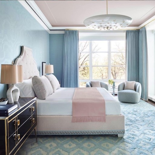
Bright Skies and over light wash blues are perfect for promoting a sense of serenity in your home, and those who feel connected to the colour should consider dowsing their bedrooms in this calming shade. The most outlandish trend of all the Instagram blue interior design trends, this ‘more is more’ approach fully embraces the cooling tones for a total breath of fresh air.
Colour blocking
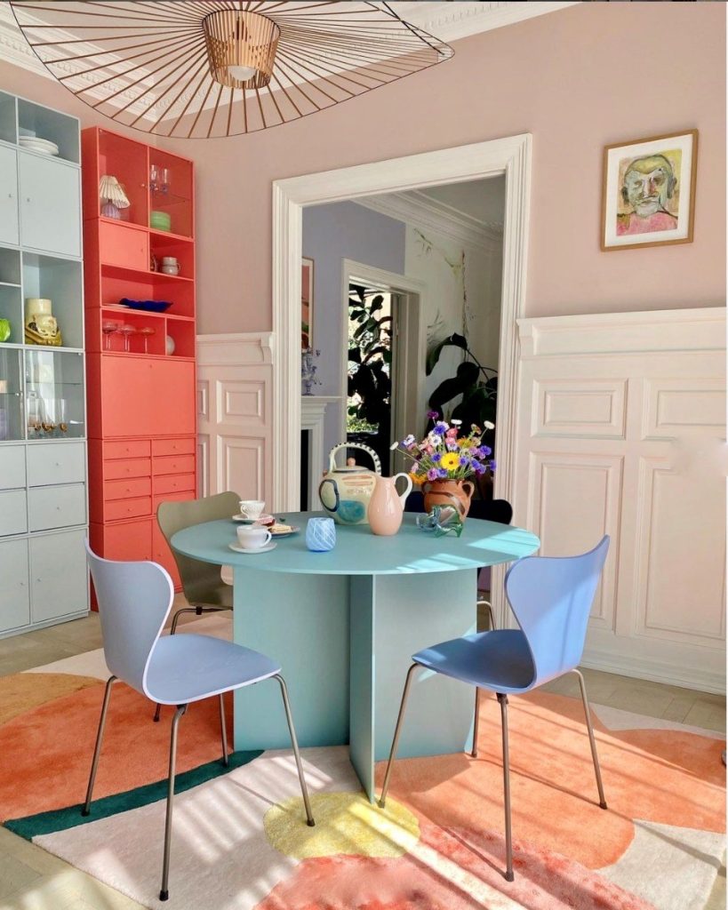
For those who aren’t afraid to embrace the bold, one of the best ways to really make cool tones zing is colour blocking with opposite complementary colours, like orange and peach. Colour blocking works best with sharp, contemporary lines and shapes, which allow the eye to soak up the bold colours at play.
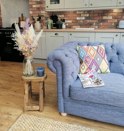
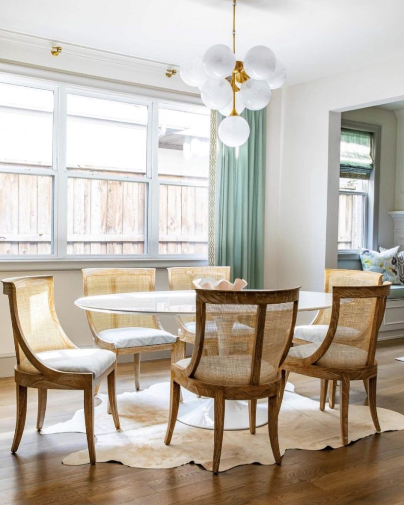
Soft blue – soft furnishings
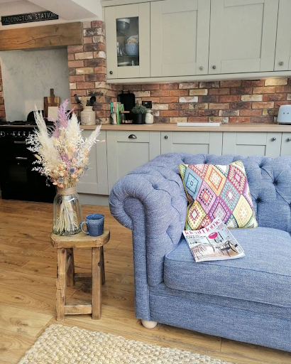
Often, when working with colour, focusing on key pieces to work with is the best approach. Softer, corn-flower blues are great for drawing on when working with a neutral pallet, to give the room a grounded feeling.
Impactful wallpaper
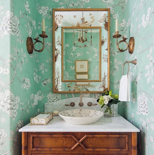
For those who are partial to a statement wall, light blue focused patterned wallpaper is a fantastic way to juxtapose this calming tone with an exciting and bold pattern. This design tactic works amazingly in alcoves to accentuate the space, bring in colour and light and help make the room feel larger.
Backdrop tiles
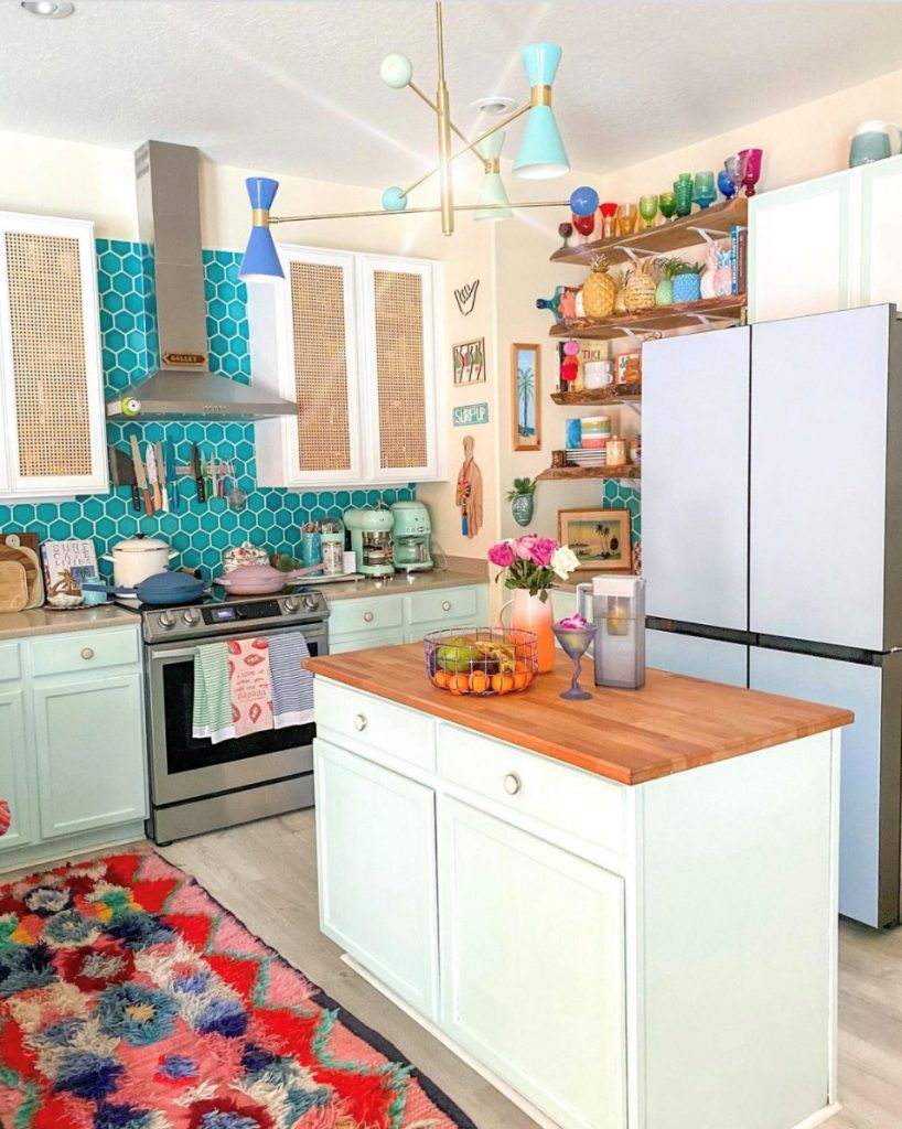
Make your kitchen splashback part of your kitchen look with a bold backdrop tile wall to inject azure tones into your space. Making these tiles a feature, by tiling higher than normal, to accentuate the height of your kitchen.
A subtler approach
For those who favour a more minimalist, Scandi design approach, embracing new colours such as Bright Skies could feel quite alien. However, these soft blues work incredibly well with a muted palette and natural textures so bringing in a cool-toned blue through subtler tactics, such as accessories and soft furnishings, will allow you to embrace the new colour palette without drastically changing your style.