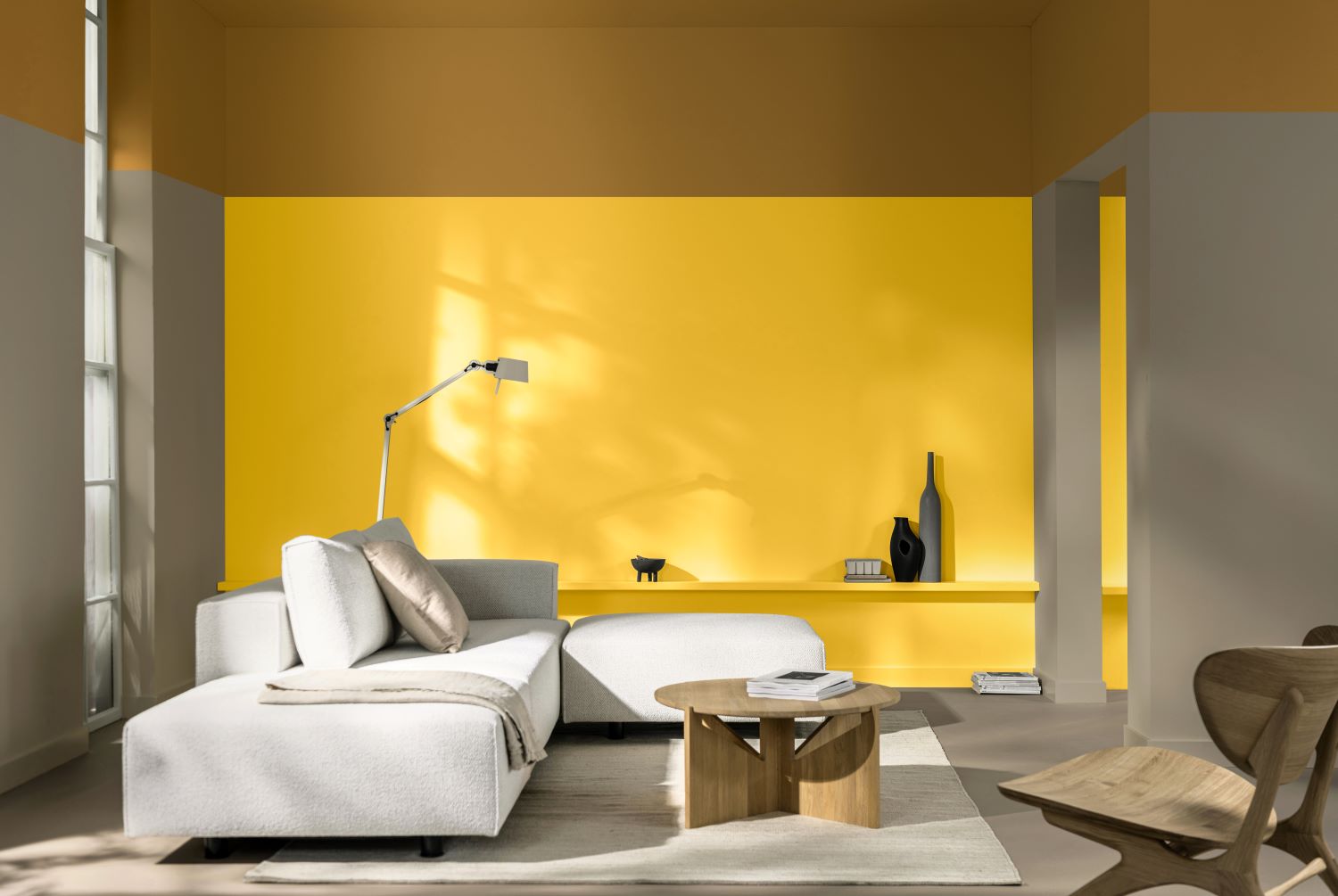
For 2025, Dulux is encouraging architects, specifiers, and designers to embrace yellow—a colour symbolising optimism, pride, and imagination. With the aim of helping professionals introduce vibrant, positive shades to their clients, Dulux has named True Joy as its Colour of the Year 2025, complemented by three versatile ColourFutures™ palettes.
For over two decades, the Dulux Colour of the Year has been selected through rigorous trend research conducted by colour experts and global design professionals. True Joy, a bright, uplifting yellow for 2025, embodies the human desire for freedom, renewal, and innovation. Dulux encourages designers to spread the energy of yellow, supporting clients in stepping out of their comfort zones with confidence.
Yellow shades like True Joy can make bold statements or be used as accents. To assist designers with ideal colour combinations, Dulux has curated three supporting ColourFutures™ palettes:
- Bold Colour Story: Inspired by adventure and spontaneity, these vivid hues add energy to spaces. Bright blues and oranges contrast strikingly with yellow accents, making them perfect for creative environments like educational institutions and offices.
- Human Colour Story: Reflecting the craftsmanship of wood and clay, this palette honours the use of natural materials in handmade processes. These warm, authentic tones are ideal for educational and healthcare settings, bringing comfort and authenticity to spaces.
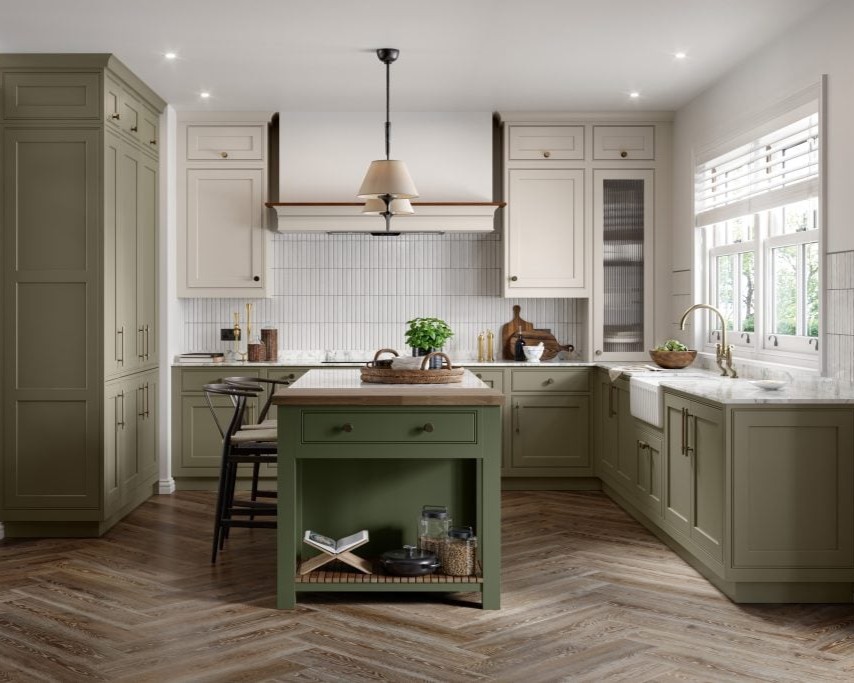
- Proud Colour Story: Rich, earthy browns and greens drawn from global cultures celebrate diverse heritages. These shades are well-suited for hospitality and residential spaces, creating a homely and welcoming atmosphere.
According to Dawn Scott, Senior Colour Designer at Dulux Trade: “True Joy™ and its complementary palettes provide a new outlook on how colour shapes our built environments. These shades are more than trends—they are tools for architects and specifiers to design spaces that reflect their clients’ values and visions, enhancing our experiences within those spaces.”
“One of the most impactful uses of True Joy™ is in healthcare settings. When combined with the earthy tones of the Human Colour Story, it transforms waiting rooms and communal areas into uplifting, calming spaces. This pairing not only brightens the atmosphere but also fosters warmth, creativity, and a sense of well-being for patients and staff alike.”