Barbiecore design: Taking inspiration from iconic style
Today we hear from Matthew Currington, the Technical Director for The Lighting Superstore as he explains how one of the most iconic pop culture figures of all time has influenced interior design.
It’s hard to deny Barbie’s everlasting influence across multiple generations, the fictional blonde and her pals are experiencing a cultural renaissance thanks to the upcoming Barbie movie hitting cinemas this month.
Since this announcement, there has been a resurgence in this hyper-pink aesthetic. The trend, known as Barbiecore, has infiltrated its way into our lives. In fact, the term Barbiecore has seen a 500 percent increase in Pinterest searches over the past year. On TikTok, videos with the hashtag have been viewed over 415 million times.
But it’s not just our clothes and accessories that are being influenced, there is now a hot-pink energy shift in our interiors.
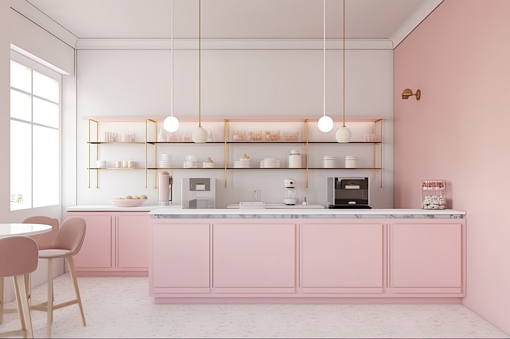
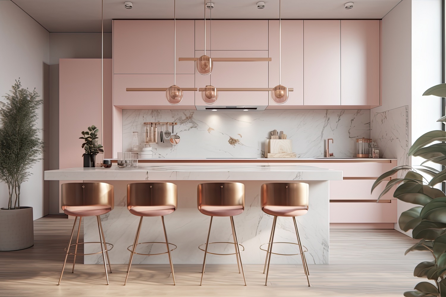
Although Barbie’s Malibu Dreamhouse is mostly decorated in hot-pink, Barbiecore can provide some more subtle inspiration in your home. This trend is all about embracing a flirty, fun and smile-raising vibe that’s perfect for summer.
You don’t have to paint your walls a bold shade of bubble gum if that’s just not your thing.
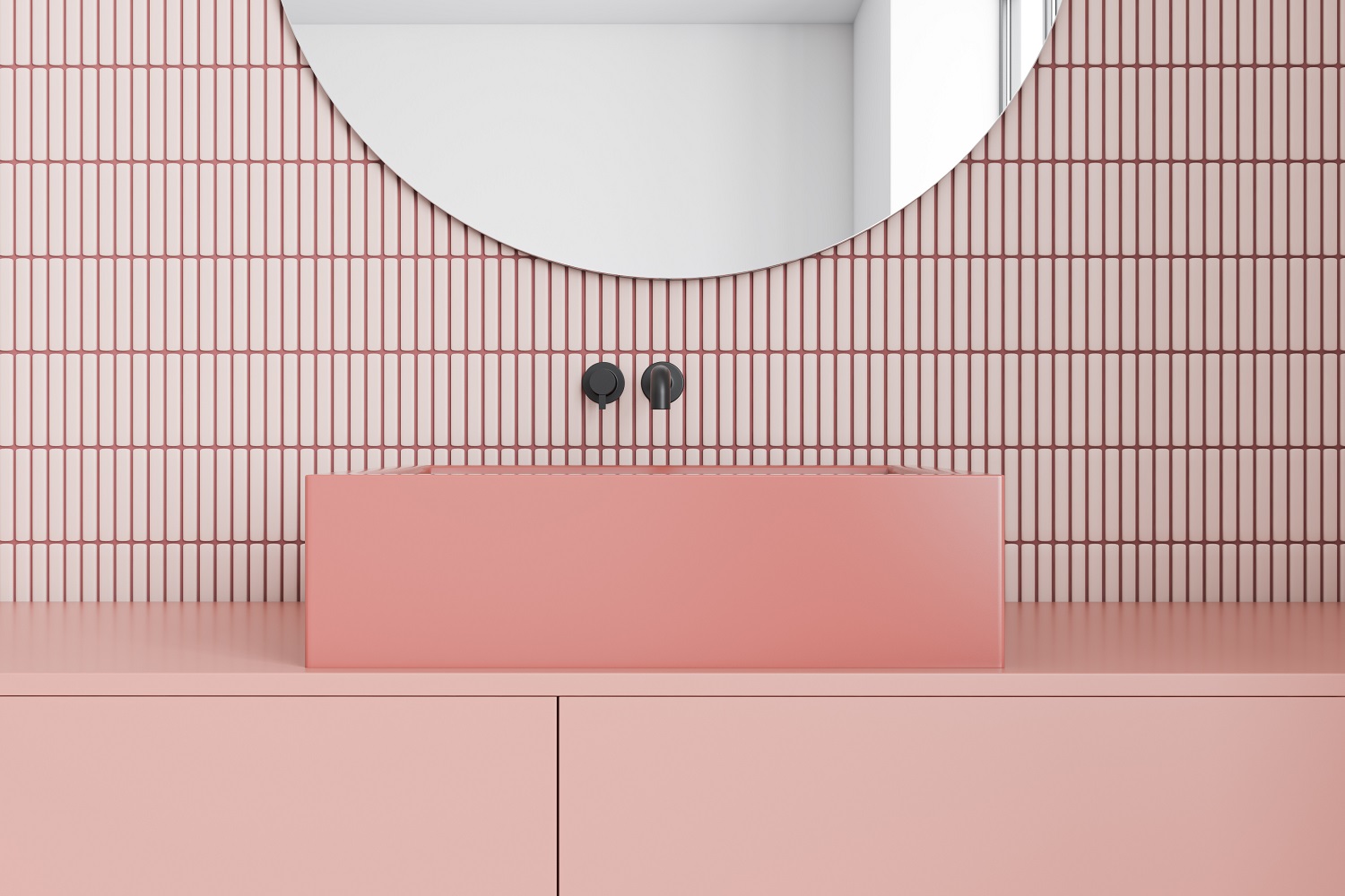
Dusty shades of blush offer a subtle take to this trend, whilst still gaining the playful softness that makes Barbiecore so popular.
If pink walls just aren’t for you, then introducing the colour through bed linens, towels, and throws is a quick and easy alternative. Incorporating pink through lighting choices is a fun and cost-effective way to add a pop of colour to your space. Consider pink lampshade bases or a pink velvet ceiling fitting for a subtle change.
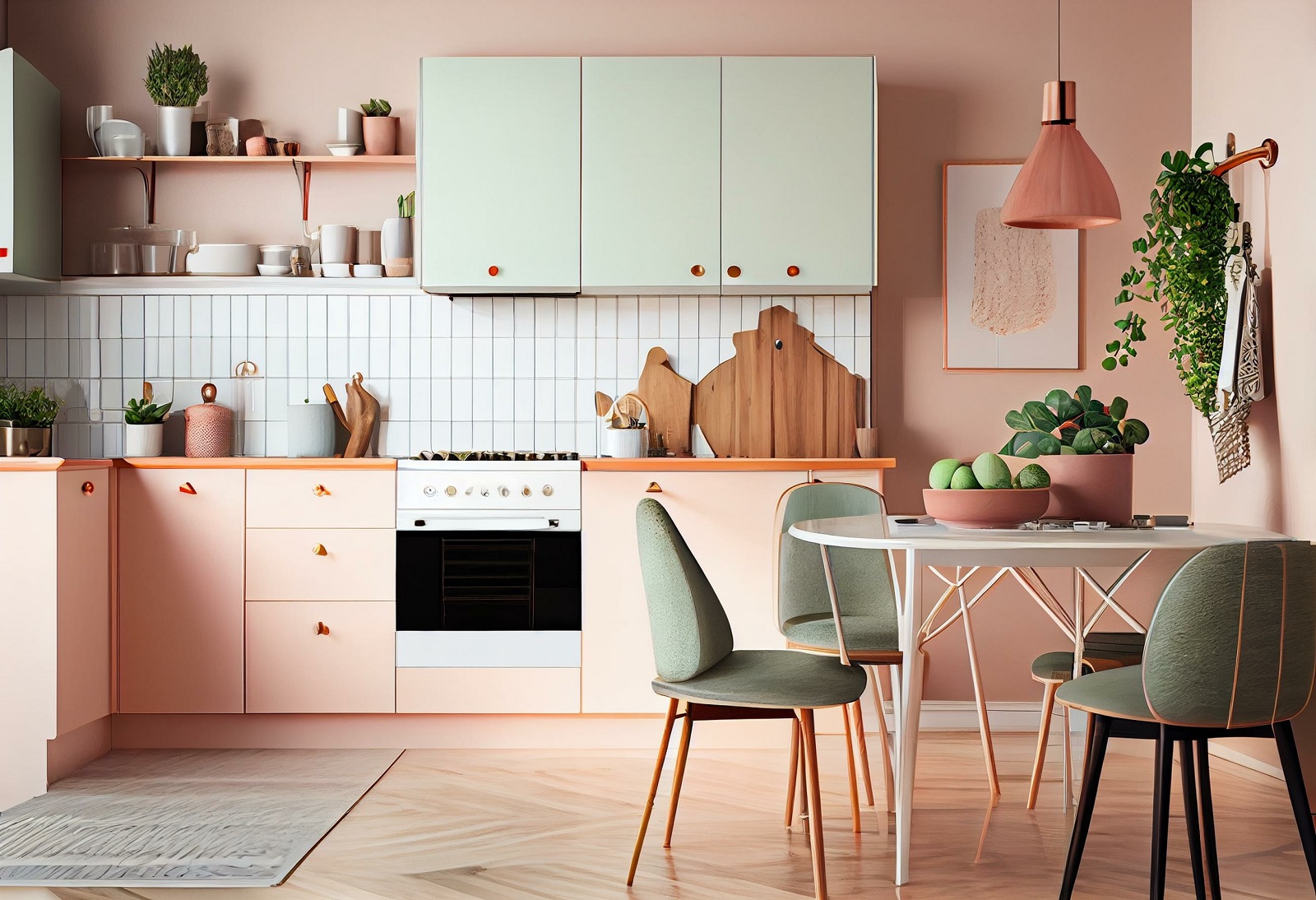
Of course, you can also keep things super subtle by incorporating scallops, frills, or small floral prints into your space for more cost-effective solutions.
Most importantly, you need to know the best colours that go with pink. We’ve all heard warnings about clashing pink and red or perhaps pink and orange, but there are instances when they work – the trick is to know when, and in what setting.
Knowing what colours, you want to pair it with depends on the overall vibe you want for the space.
Pink and black can be harsh and offer a punky aesthetic, which is not a bad thing. Pink and grey can be mournful in a retro way, while pink with orange can feel very sixties. There’s also pink and white, which is very fresh. A monochromatic look with varying shades of pink can also be a fun and bold option. The trick is to include various textures and patterns, so your space doesn’t have a 2D look.
And finally, think about what you use your room for, how much light it has, and what colour your furniture is before adding pink into the mix.